🎉 GNA重磅推出全新概念LOGO 🌟 Introducing GNA's logo makeover! 🌟
在GNA陸續展開新計畫的同時,我們也希望為既有的主視覺注入更多活力和豐富多元的面貌。這次我們推出了線條簡鍊,卻富饒趣味的時髦設計,快來看看LOGO設計背後的意涵吧!
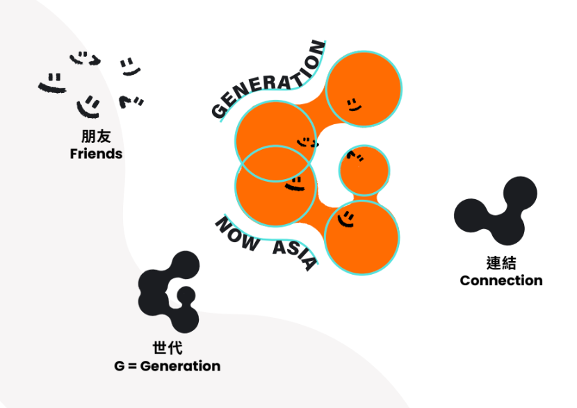
🔸 顏色:我們保留了 GNA 的代表色-- 橙色。 為什麼呢? 橙色是充滿活力和能量的顏色。年輕人常被認為充滿活力,對生活充滿熱情,因此橙色非常適合代表年輕的活力和朝氣蓬勃。
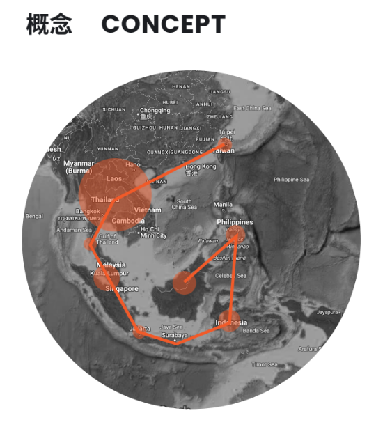
🔸 形狀:G 代表 Generation Now Asia,但除此之外G還具有其他意義喔!如果您拿起一張地圖,把台灣和東南亞以點和線連接起來,你會發現它像一個 G ! 這個 G 由相互連接的獨立圓圈組成,每個圓圈都是獨立的,但彼此又不可分割,如同台灣和東南亞地區的關係。
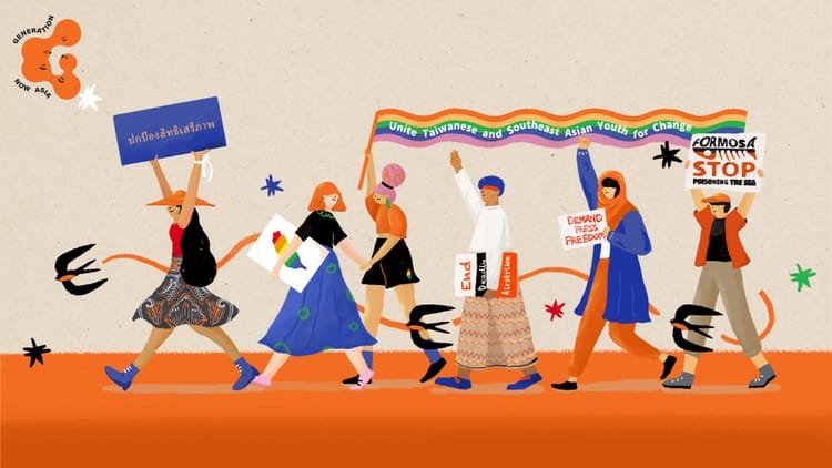
🔸 臉孔:您能看出我們LOGO上的小臉孔嗎? GNA 的核心價值是建立起台灣和東南亞的緊密聯繫,這些小臉孔代表著 GNA所 珍惜的人們和情誼。
希望您像我們一樣喜歡GNA的全新LOGO,告訴我們您怎麼想的!
We've been working to add some pizzazz to our visual identity, by upgrading to a sleeker, snazzier, and oh-so-stylish new logo!
We’re so happy with it and would love to share the meaning behind it with you:
🔸 The colour: of course we kept GNA’s identity of orange.
But why? Orange is a vibrant and energetic colour. Young people can be associated with being bright, enthusiastic and having a zest for life, making orange a fitting representation of GNA's mission to empower youth changemakers.
🔸 The shape: G for Generation Now Asia but also if you look at a map of Taiwan and Southeast Asia, if the target areas are connected with dots and lines... well doesn't it look like a G? In our new logo's design the G is composed of individual circles that connect to each other. Each circle is independent yet also inseparable, just like the relationship between Taiwan and Southeast Asia.
🔸 The faces: can you make out the little faces on our logo? GNA is all about building connections and community, these faces represent the people and friendships that GNA treasure.
We hope you love our new logo as much as we do, let us know what you think!